The Beginning
We started our journey by creating a branding for our creative team. Our creative team consists of Lilly Webster, Giselle Scott, Jack Pfiszter & Harry Pfiszter. We called ourselves Studio602 based on our university class which was called Grad602.


Monday 02 December 2019
We went to AUT from 12pm – 2pm where we set up our WordPress blogs and then walked down to the Auckland hospital from 2pm – 5pm where we met with Justin & Sean and some other members of the release and time to care team where we reviewed the briefs and asked further questions we had. As a group, we then all took some time to review our plan for the next three months work. We have planned to meet continuously with the Auckland Hospital team on Mondays, Wednesdays & Fridays from 12 – 2pm to ask any questions.
Project 01 Notes | Nursing shift planner
Basic needs for the app – Patient details, plan of care & needs of patients.
Charge nurse overview & ability to redistribute resources.
Communication between nurses and patients – Nurse / Patient view (Tiered access).
Behaviours of concern – Silent alarm.
Trend Care – A current system which predicts how many resources are spent on each patient.
Currently one tablet per ward – Surface GO, We also need to design for Mobile
Potentially wearable devices
Notifications – tick off to disappear
Four questions which a nurse is supposed to ask each patient every hour – are you in pain? do you need to go to the bathroom? can you reach everything? do you need to be moved?
Nirvana – moving a patient would trigger a logging of the admin / data.
Project 02 Notes | Releasing Time to Care Information Dashboard
Creating an app for data collection and data processing.
Currently every three months or six months, one nurse follows another around to collect data to document where their time is spent.
Plans & Skeleton
Data entry (based on the NHS system) > Data collection & graphs > Push through to head nurse and data entry points.
Nirvana – filter data of just e.g. admin time across all of the different wards so that they can compare why obs has a better patient care time.
Nirvana – find a way to get rid of the shadow nurses and free up resources.
Unachievable Ideas
Hot spot / QR codes / Swipe key cards (Project one)
Voice data entry – similar to police Taga app (Project two)
Tuesday 03 December 2019
The four of us got together to decide on a plan and begin our user research.
Five Key Words
Trustworthy / Secure
Efficient
Intuitive
User friendly
Transparent
Patient & Nurse User Flow
01. Patient arrives at Auckland DHB
02. Patient of family / friend enters details on web or kiosk
03. Get triaged
04. Charge nurse gets notified of new patient assigned to their ward
05. Charge nurse checks availability of nurses and assigns new patient
06. Nurse is notified of new patient
07. On visit with patient complete care plan / needs
08. EOS push through to change over nurse
How Might We
Increase time of care with patients?
Create a more efficient system?
Address nurses who don’t carry phones
Address nurses who don’t want to use an app
Design an app which all skill levels feel comfortable using
Design an app which is user friendly
Design an app which is intuitive and safe
Design an app which discourages use of paper
Make an app which is transparent between patients and nurses
Make an app which is transparent between nurses and nurses
Set ourselves apart from every other basic planning app
Monday 09 December 2019
Plan for our work
Long & Short Term Goals
Our Questions
User Personas
Empathy Map
User Journey Maps
Solution Sketch
Storyboards
Sitemaps
Wireframes
User Testing
Intentions & Next Steps


Wednesday 11 December 2019
User Flow


Quick Concepts


01 A split view of your assigned patients and your daily planner, highlighting single or multiple patients at once will filter out different tasks.
02 A rolling calendar that scrolls through the days tasks as they are scheduled.
03 A virtual waiting room (database) where patients information is stored where a nurse is able to go in and select their patients and add them to their daily planner. Be able to access all the patients that have been assigned to the ward.
04 On the main screen, you can swipe left and access the individual information cards of each patient, and if you swipe right, you are able to see a view of upcoming tasks. On the main landing screen, you are able to see an overview of your day (nurse planner). Buttons at the bottom for ending a shift, adding a patient etc
05 A rolling to do list with an overflow menu for tasks that may have been completed however not ticked off. These will stay on the screen so that they are kept on the mind in case they have been missed. This will be cleared once the user checks them off manually.
06 A full patient list to allow the user to check their assigned patients in one menu.
07 A calendar style view of the daily planner. This could be laid out vertically to make better use of the portrait phone screen.
08 A vertical time blocking to do list, based on one part of your screen being the consistent ‘now’ time and the whole thing scrolls up as time goes on. Then when things are not completed on your timeline, it keeps scrolling but adds those tasks onto a to do list which is found at the top. It turns the bar blue which you then swipe down to show all of your uncompleted tasks. (Another option is to be able to unfix the time so the ‘now’ line stays the same but as you scroll up and down it moves tasks to your to do list as you go, if you reverse it and take it back to 9am then it puts them back on the main page.
09 The clock scrolls through and the to do list changes based on what you’ve put into that time period.
10 Similar to 09 but a horizontal swipe.
11 A more detailed version of number 08.
Friday 13 December 2019
Wireframe
We all worked together to explore the concepts further, ironing out any kinks in our designs and started to digitalise our concepts using Invision Studio. They are far from perfect and we only created about five screens, but we made a start and creating these wireframes kept presenting problems which hadn’t come up when we sketched on paper and we then had to solve them as we went.


Tuesday 17 December 2019
I transcribed the User Personas for the three nurses which we have been working with based on our recorded interview at the Auckland Hospital. It is important to note that our three nurses have all moved from being junior nurses, to charge nurses and then on to a management role within the hospital. Therefore it isn’t fair to presume that all nurses have similar personality traits to those who we interviewed, however it is clear that nurses seem to have similar personality types and the three nurses that we interviewed had similar goals in mind for the planner.


Thursday 19 December 2019
Research
We watched some youtube videos to gain further understanding of nurses and their personalities and also frustrations.
Navigation
We decided that an extremely simple navigation is the best way to

Mockups
Lilly created the following concepts as variations of how a head nurse would see how busy each nurse is and their capacity to take on new patients. This is ranked by how many patients they have but also depending on how dependent each of those patients are ranked out of three (or the current system on TrendCare). E.g. Nurse Katie may only have three patients, but they are all ranked 3/3 for dependance therefore she is still more busy than nurse Giselle who has 5 patients who are each ranked 1/3.


Harry created a navigation test


Giselle created a wireframe of the opening page which is the daily planner.


Developments of HUDDLE logo

Initial ideas 
Initial ideas 
Initial Ideas


Further Wireframing


Activity Follow: Some initial screenshots of how began to look at the start of the design process. All quick concepts that we explored in terms of colour and iconography. We decided on a light colour palette and bright colours to make the app vibrant and fun.
Current Progress – hero shots

we are aiming to create a versatile data collection app with the capacity for use in different hospital environments..

Our aim with the nurse planner is to provide a seamless transition into paperless planners in an effort to reduce unnecessary time spent planning each day.


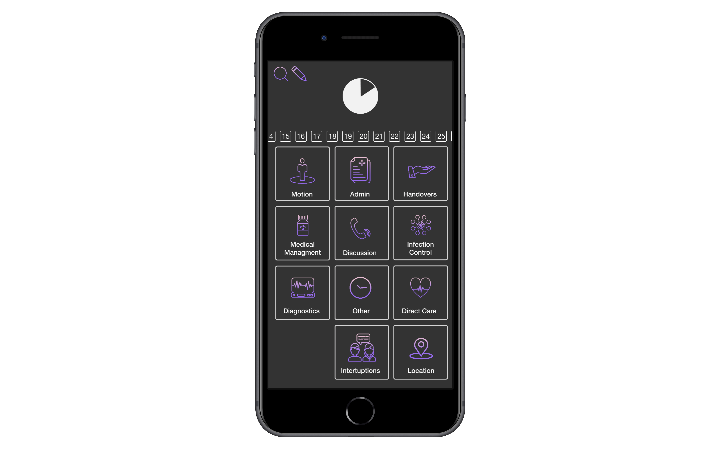
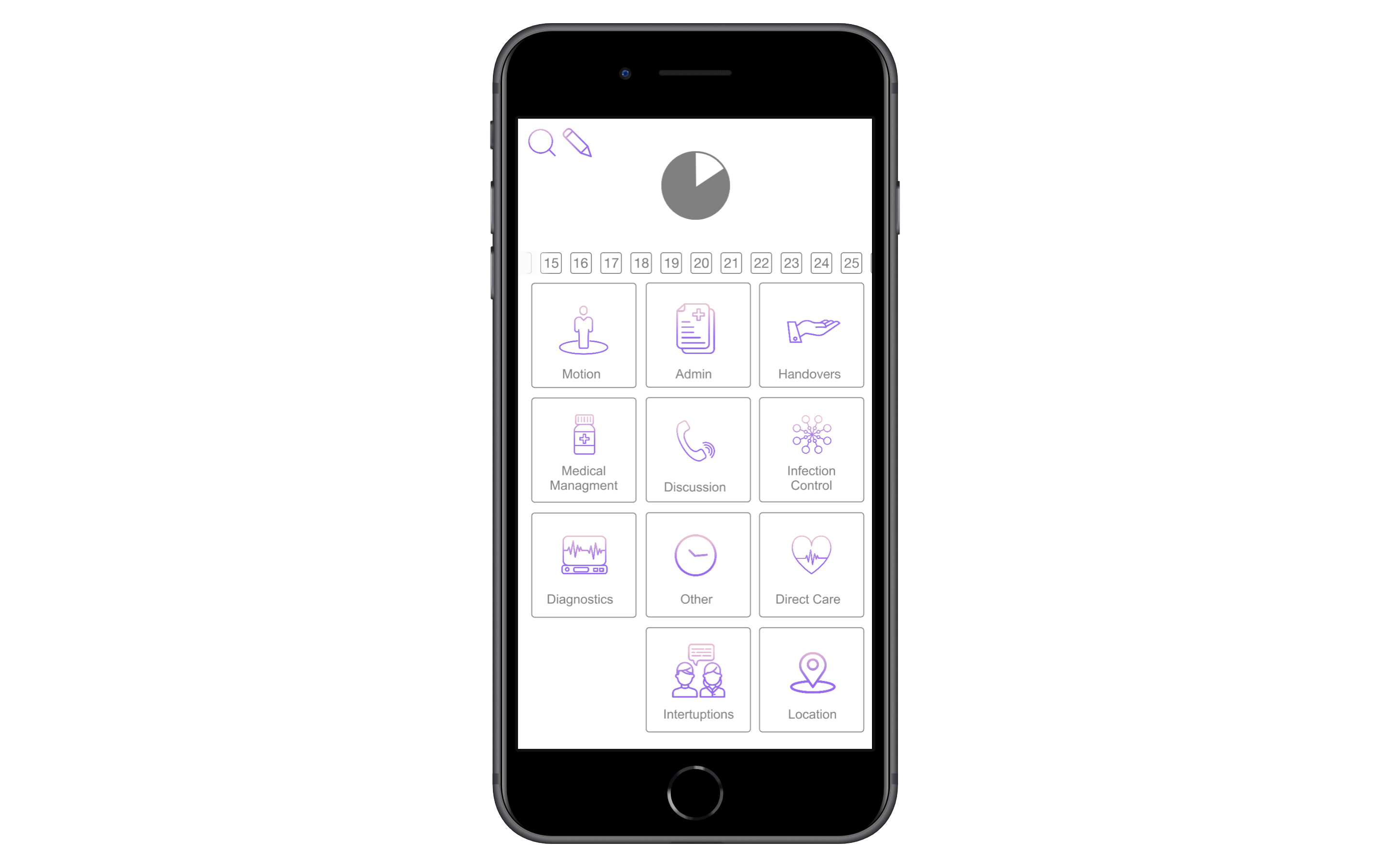
Activity Follow: Giselle started to have a look at the different ways that we could present the live data that is being put into the app during the follow. The first screen is a break down of how long the follow has been happening (3h and 28min) and then it also has the accuracy of how the follower entering the data at the right time into the app. This was to ‘gamify’ the app. This way, the follower might see this as a game and aim to get 100% accuracy during their follow, and then in turn get more accurate data. The second screen is a bar graph of all of the catagories in the app. The third is a graph to show how many minutes were spent on Direct Care at certain times throughout the follow. For example, at the top of the fourth hour during the follow, 13min had been spent on Direct Care. The fourth screen is showing a pie chart of all of the catagories and their percentage in a pie chart.


Activity Follow: There is a function in the app where you are able to start and end a break. Whilst on a break, the app logs minutes as a break so the follower can leave the follow and the app will continue to fill the minutes with accurate data.


Activity Follow: During the follow, if you need to make note of any observations then you can enter a note in the notes tab. The note will be time stamped.


Activity Follow: There is a search function within the app that allows the follower to search for subcategories in event that they cannot find it through the buttons function on the home page.


Activity Follow: Within in the app, the user is able to edit the categories so that any ward can use the app and edit it to their needs. The user can delete and add new categories as well as edit existing ones. Subcategories, the icon and colour can be edited to the users needs.

Nurse Planner: After our presentation, we revised our colour palette for Medley. We found that there was not enough contrast and differentiation between the patient buttons.


Nurse Planner Redesign: We attempted a redesign for the nurse planner to make it more readable. Instead of using this design, we decided to readjust the original design.
